Frankies
Overview
Frankies is a beloved café and dining destination in the heart of Warragul, Victoria — known for their specialty coffee, vibrant all-day menu, and a warm community atmosphere that welcomes everyone from morning regulars to corporate crowds. With two locations across regional Victoria and a loyal local following, Frankies is a cornerstone of the Warragul dining scene, and a brand with real energy worth designing for.
Challenge
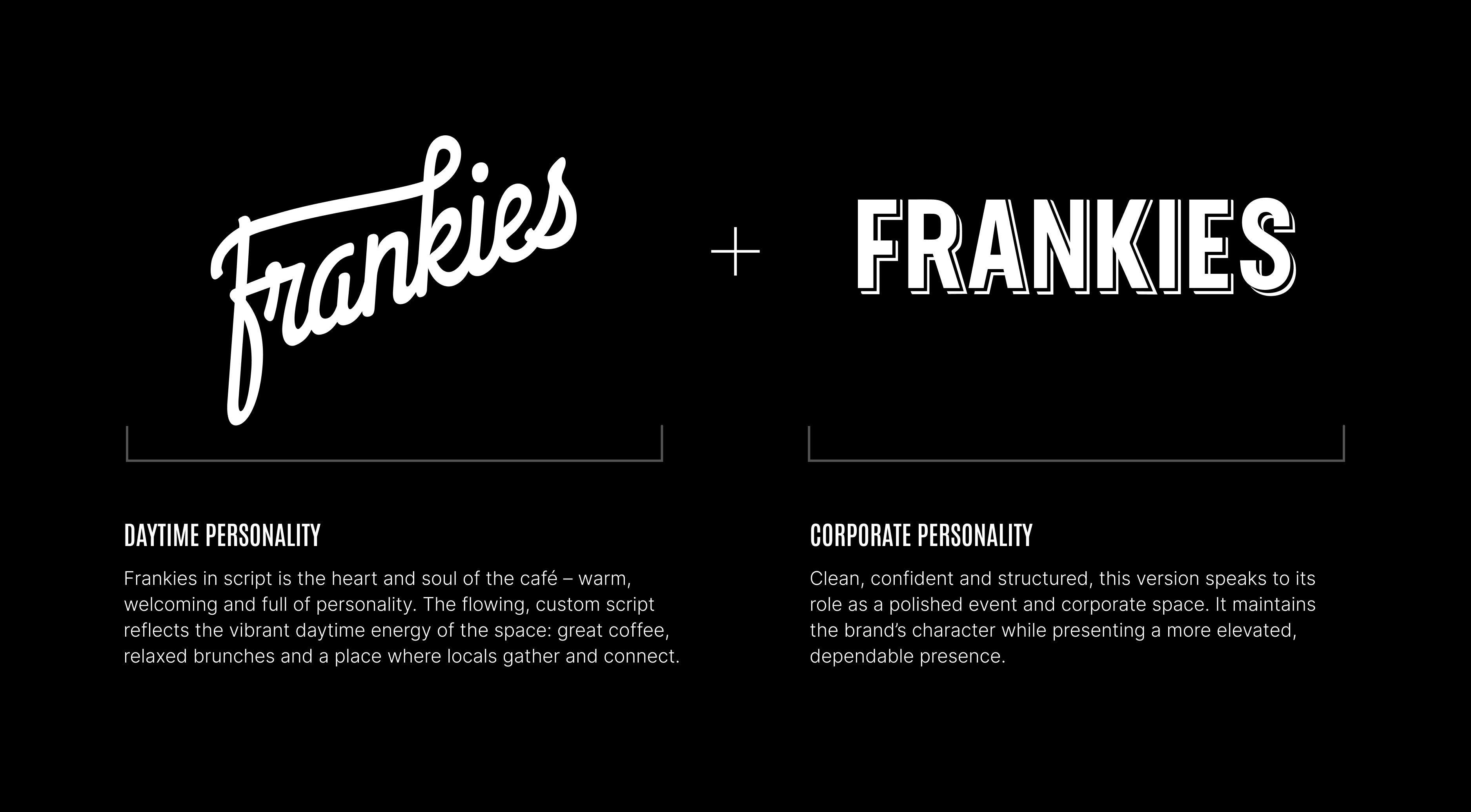
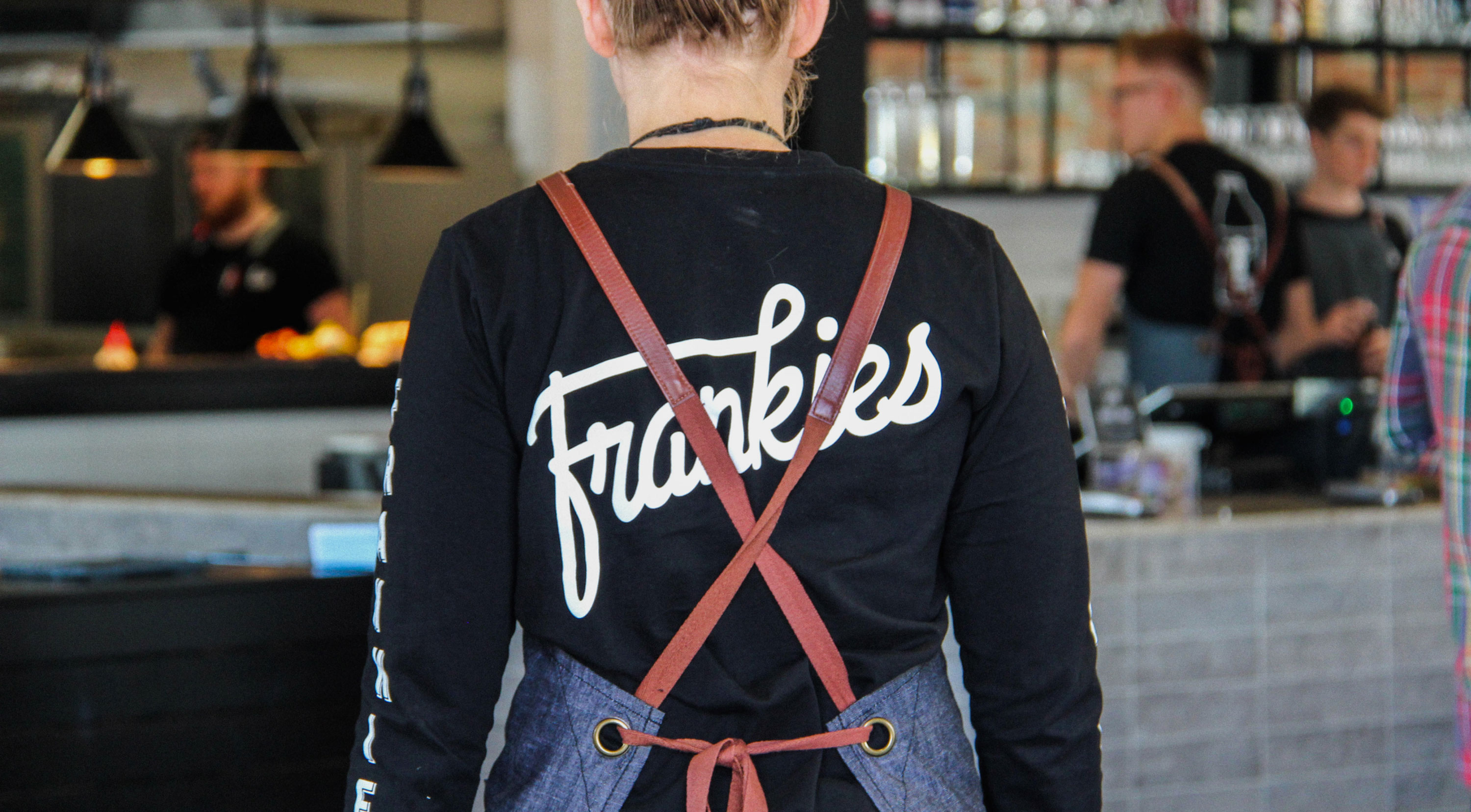
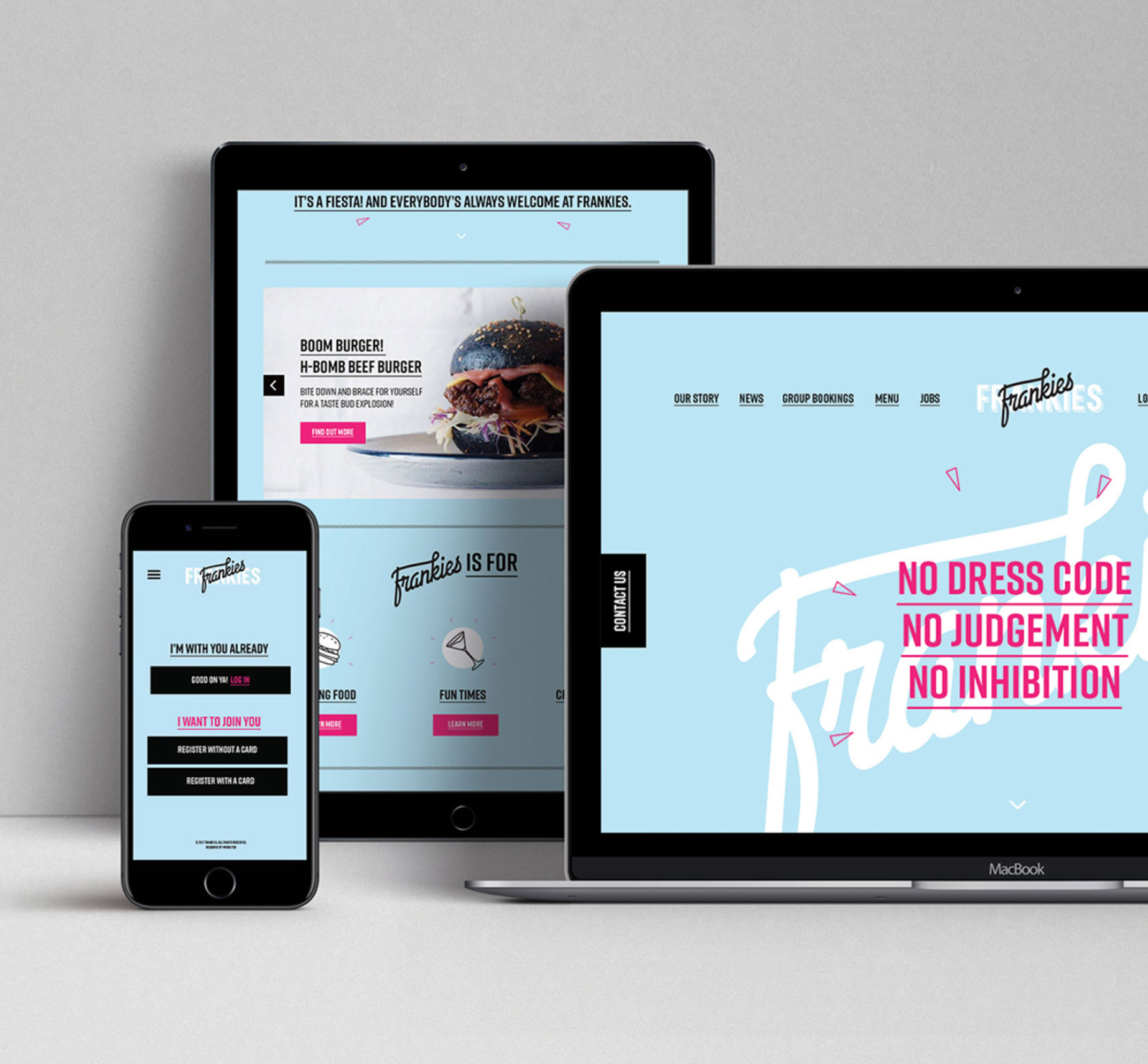
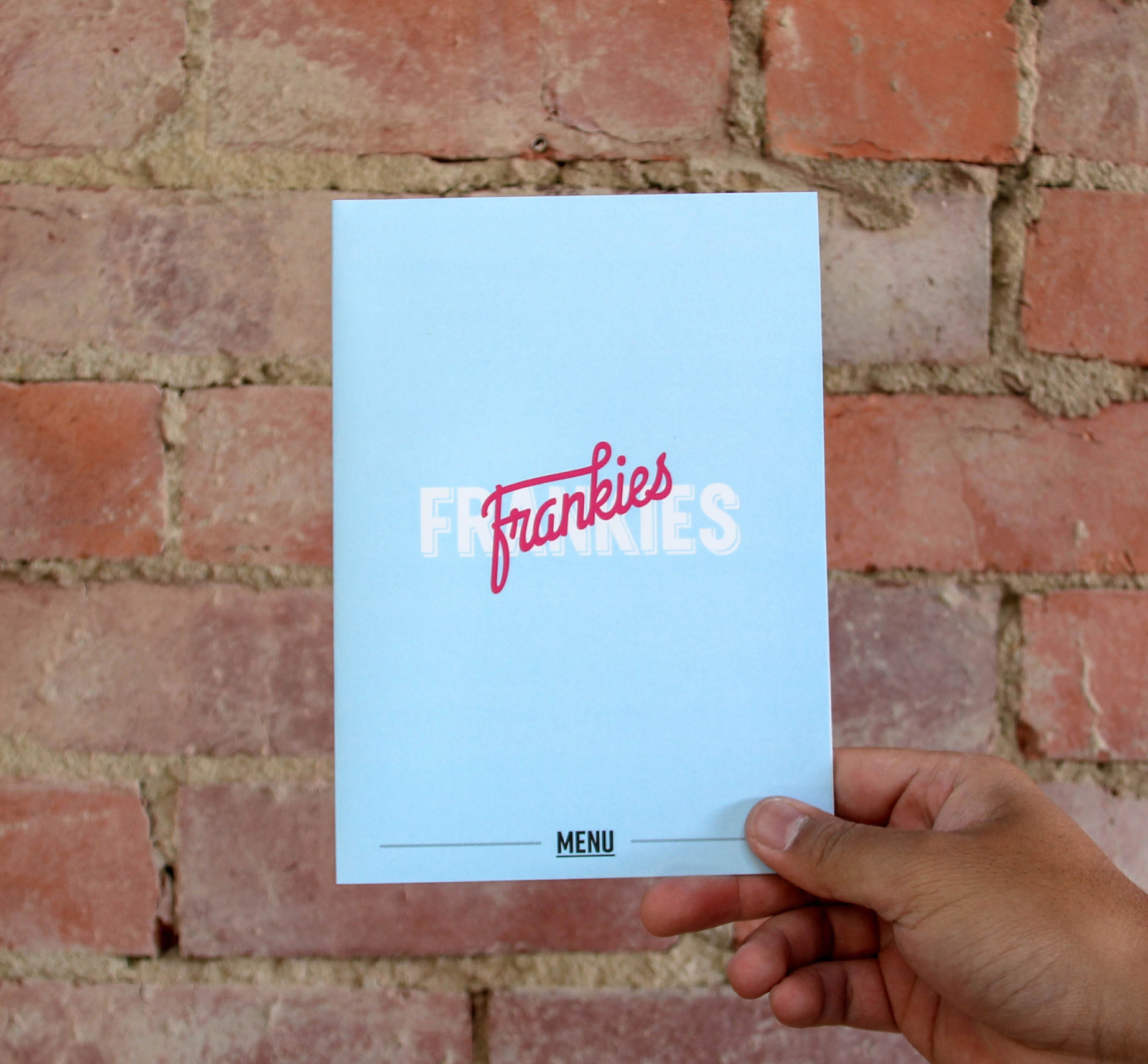
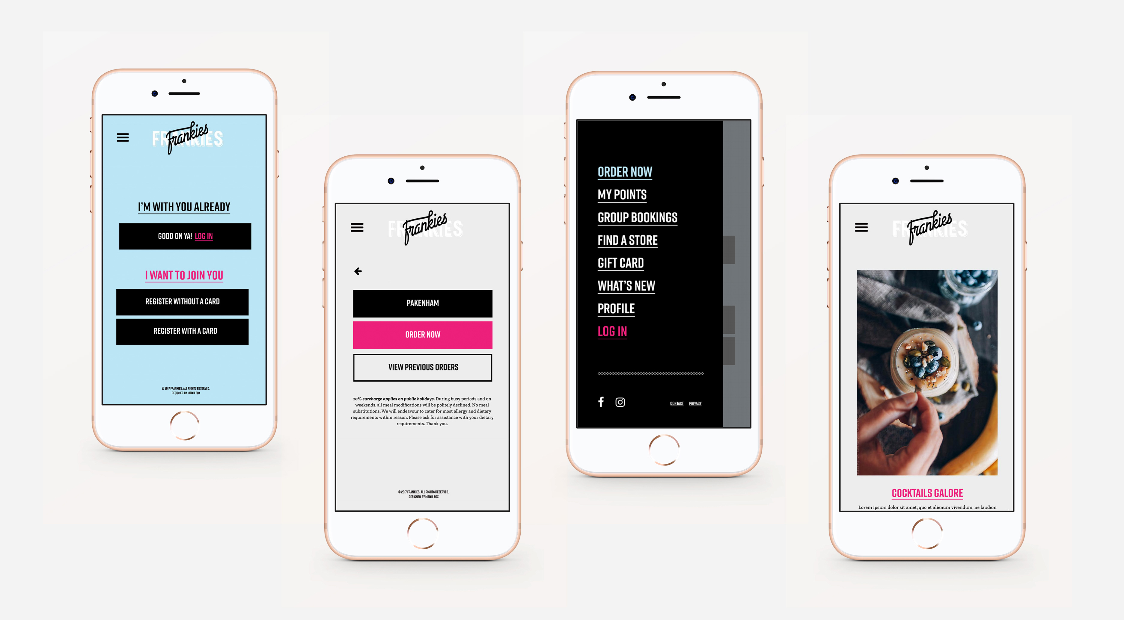
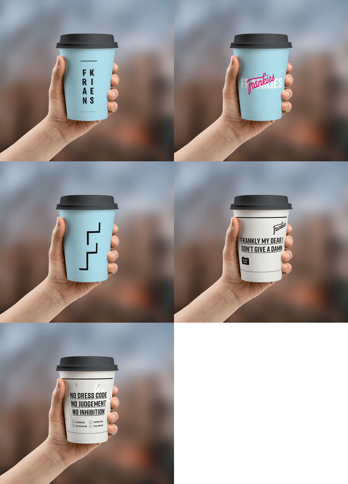
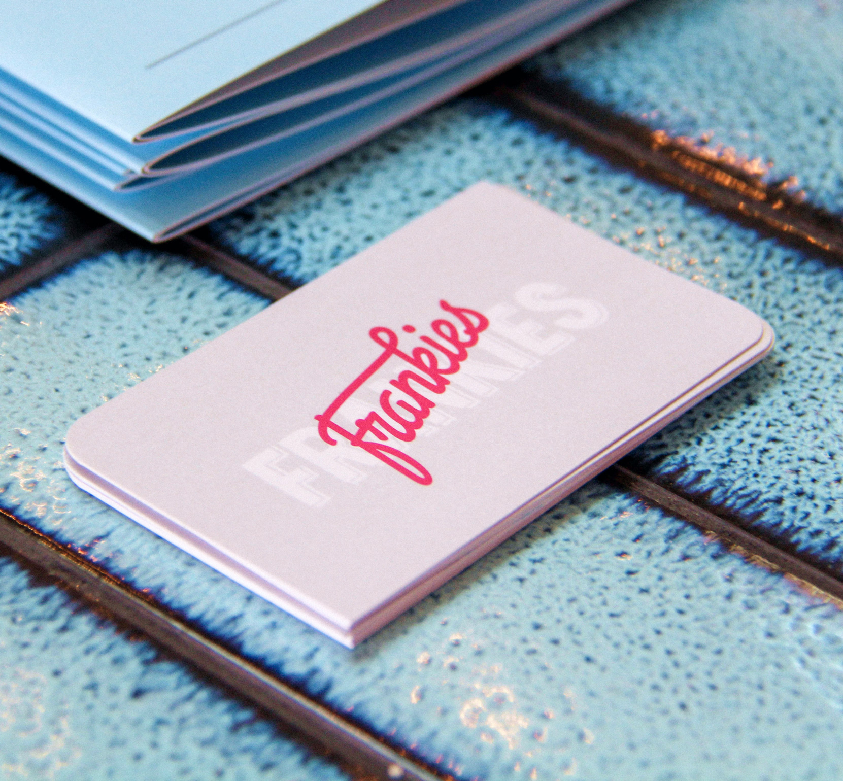
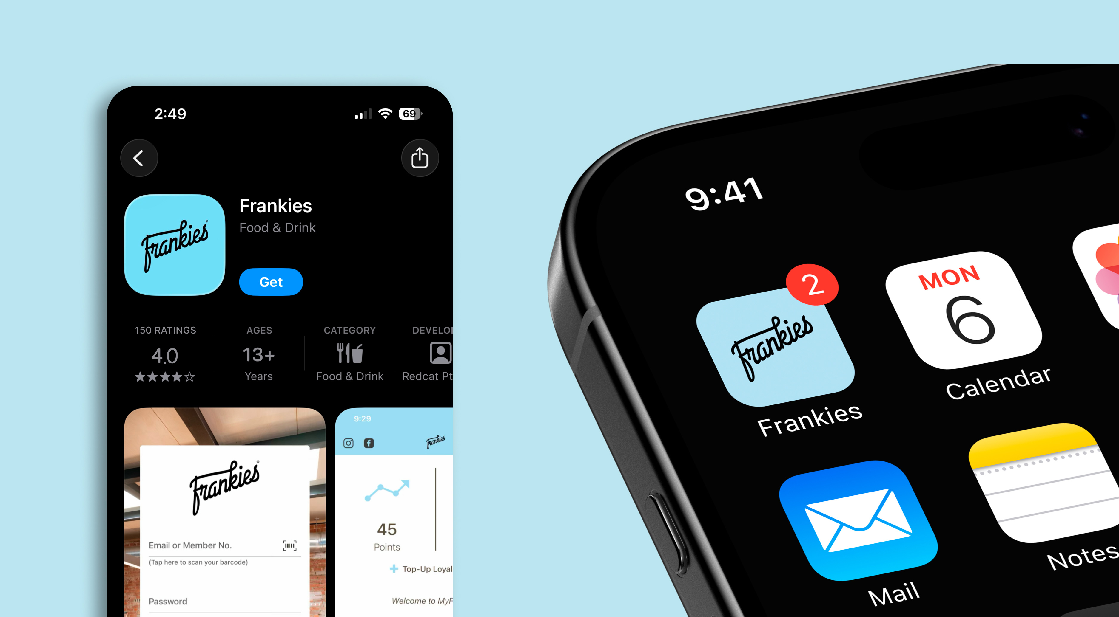
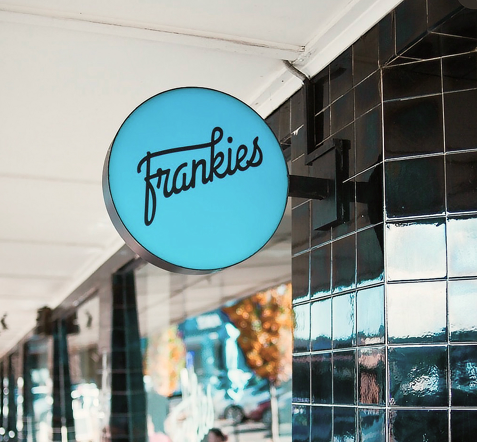
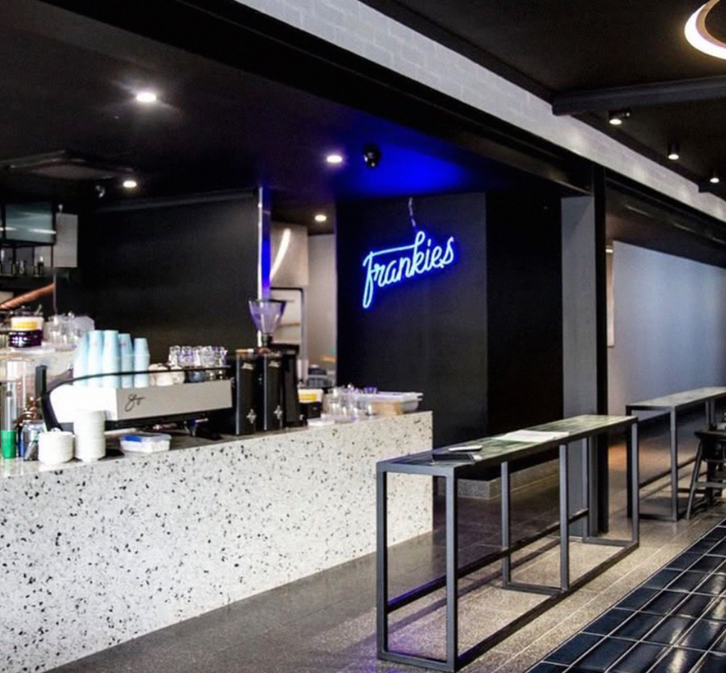
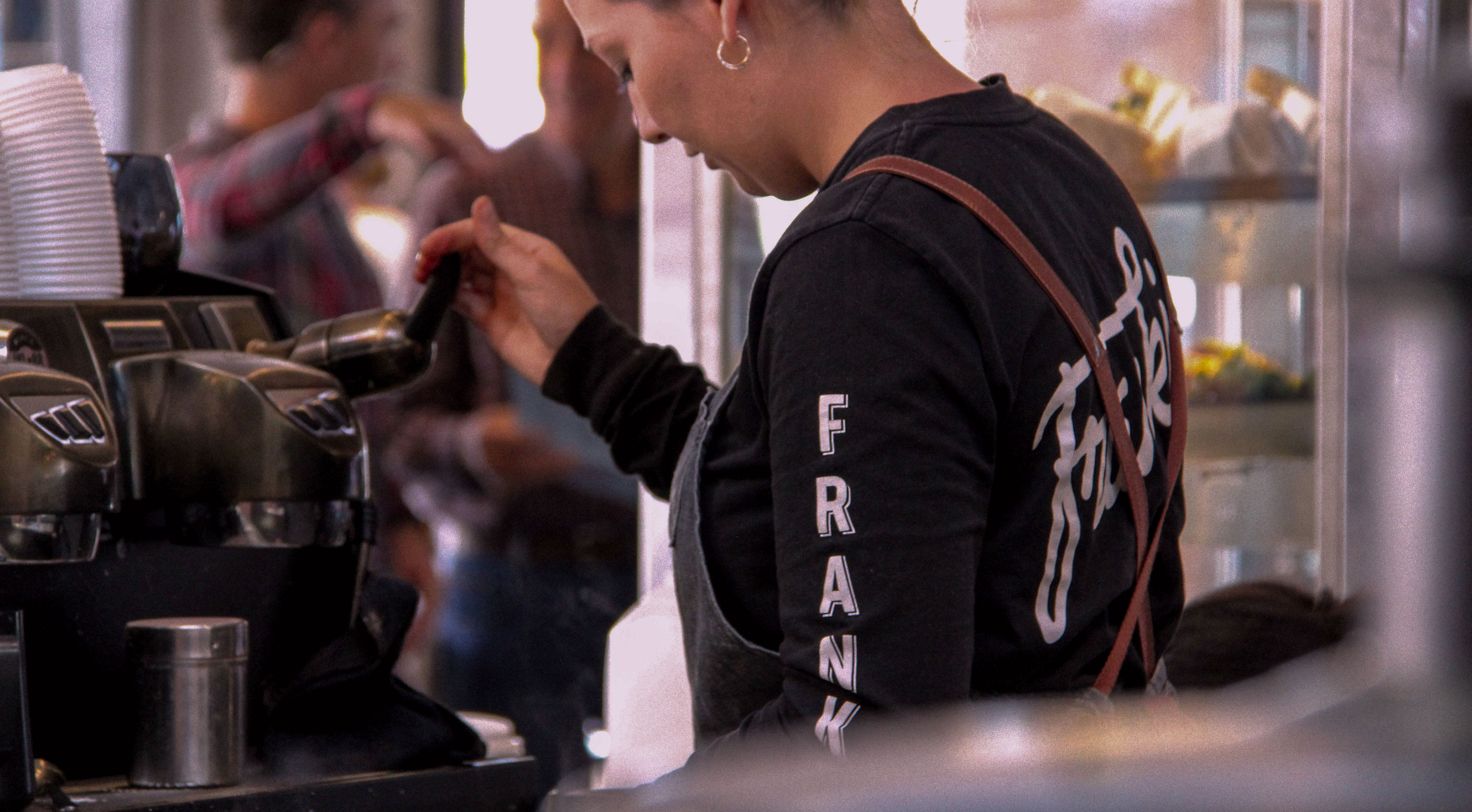
Frankies had two distinct personalities living under one roof — a sun-soaked, casual daytime café and a polished corporate venue capable of hosting white-collar functions and events. The challenge was to honor both without diluting either. That meant developing a brand strategy that unified two custom logotypes and merged a bold but light palette of blues, pinks, and black into a visual language that felt cohesive, confident, and alive. From there, the work expanded into every corner of the brand. I designed the full brand identity that included custom typography, uniforms, coffee cups, and menus etc, and collaborated on the interior design fitout for their café renovation, ensuring the physical space was as considered as the visual identity. The scope then extended into UX/UI design and app design, creating a custom ordering experience that let customers order food and coffee online — bridging the warmth of the in-venue experience with a slick, intuitive digital touchpoint.