Serenity Mosman
Overview
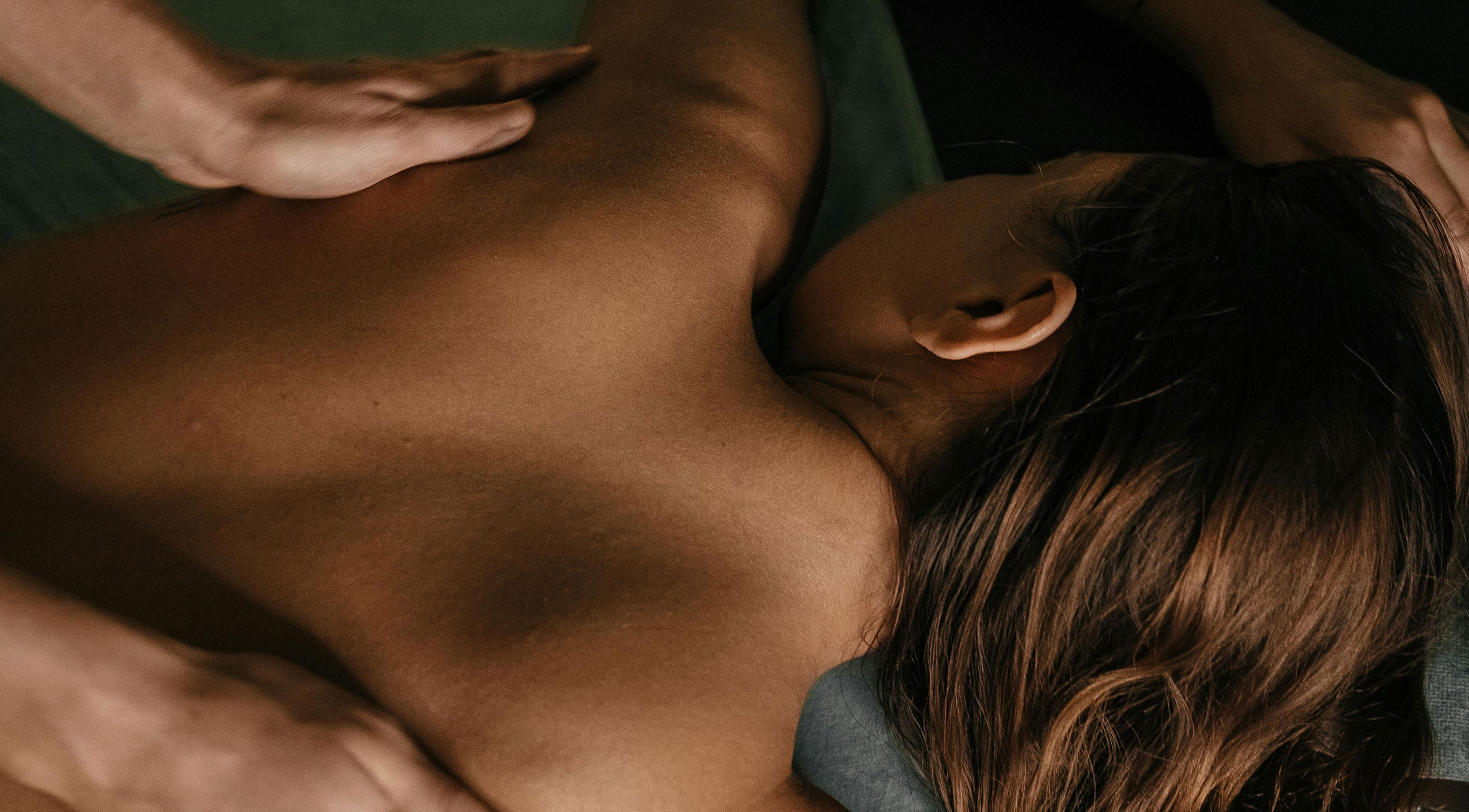
Serenity Mosman is a premium beauty and wellness spa nestled in the heart of Mosman, Sydney – offering a curated menu of treatments spanning luxury facials, therapeutic massage, Japanese head spa, advanced skin treatments, holistic therapies, and cosmetic injections. What sets Serenity apart is the rare combination of clinical expertise and genuine warmth; every treatment is personalised, every detail considered, and every visit designed to feel like a true escape from the everyday. With a loyal, growing clientele, Serenity Mosman has firmly established itself as one of Sydney's most trusted destinations for beauty and wellness — a boutique day spa experience that refuses to compromise on quality.
Challenge
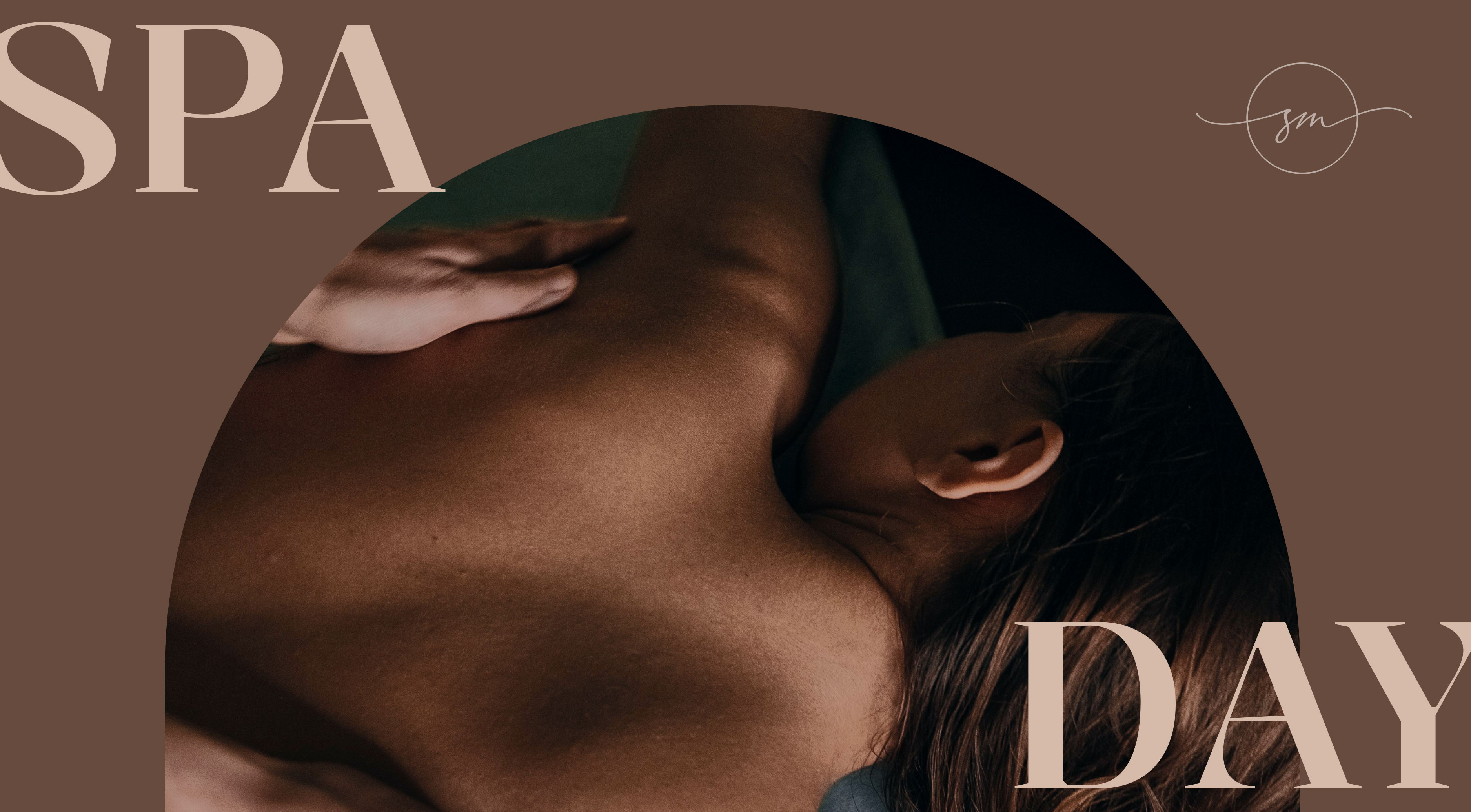
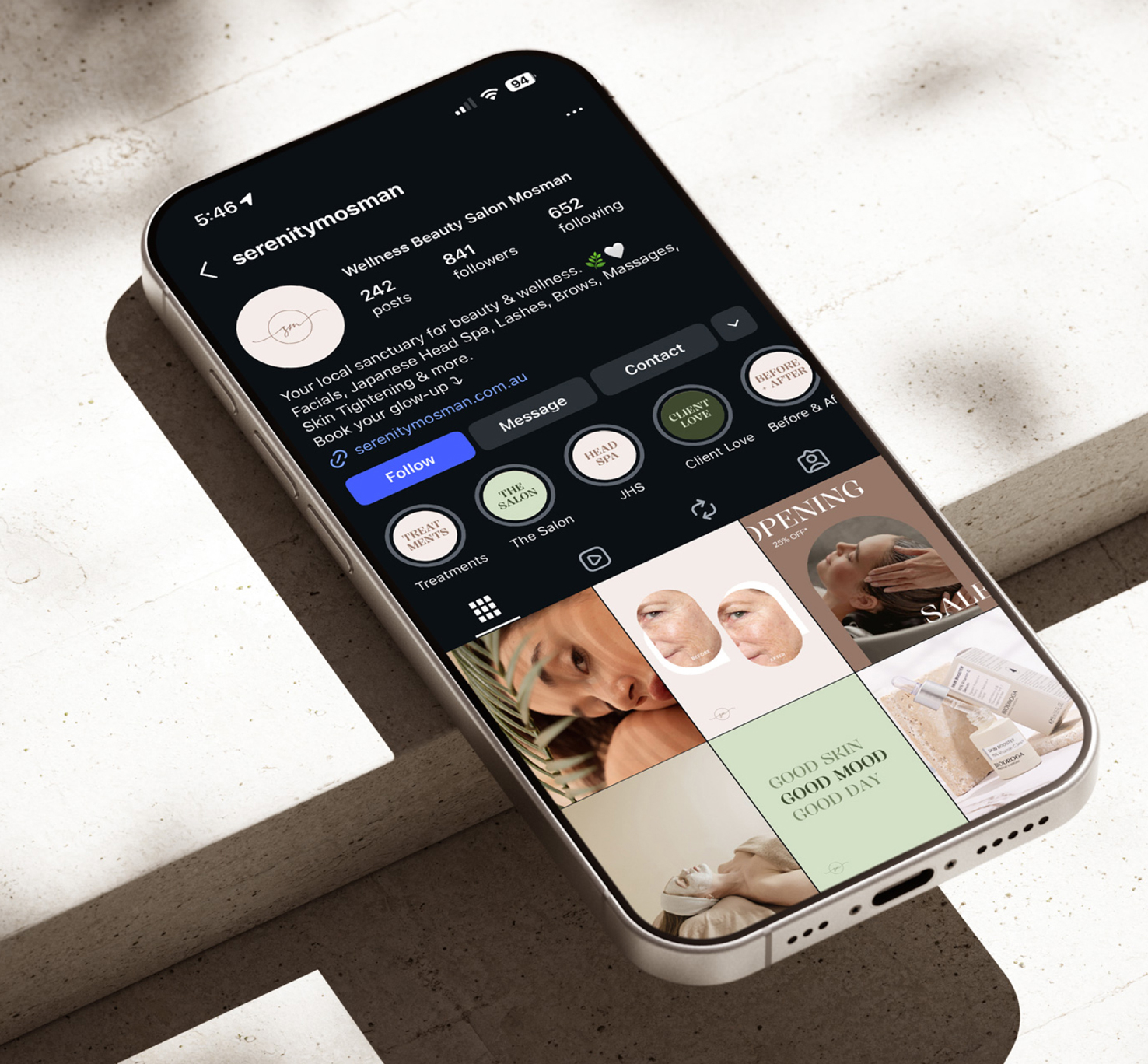
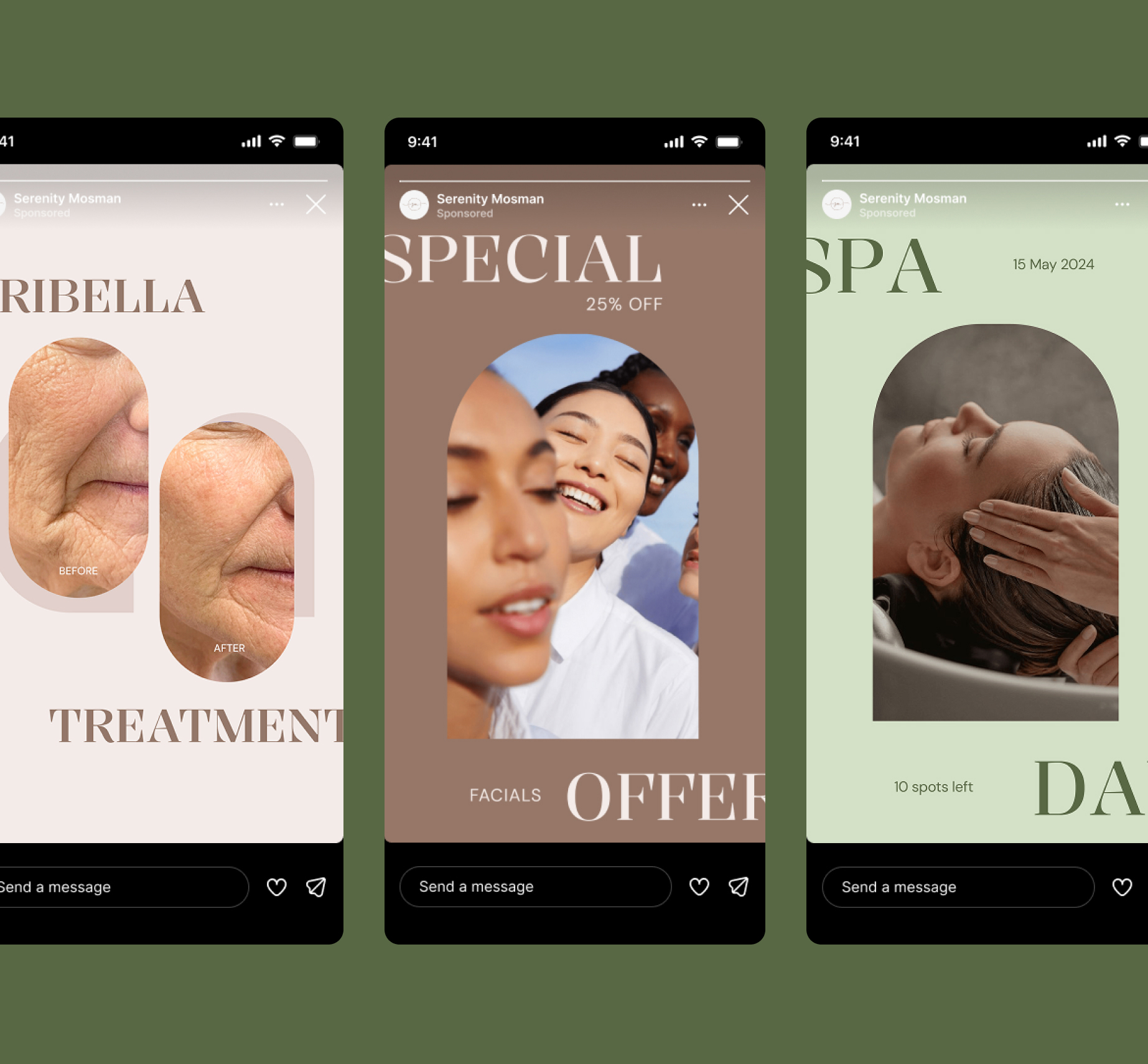
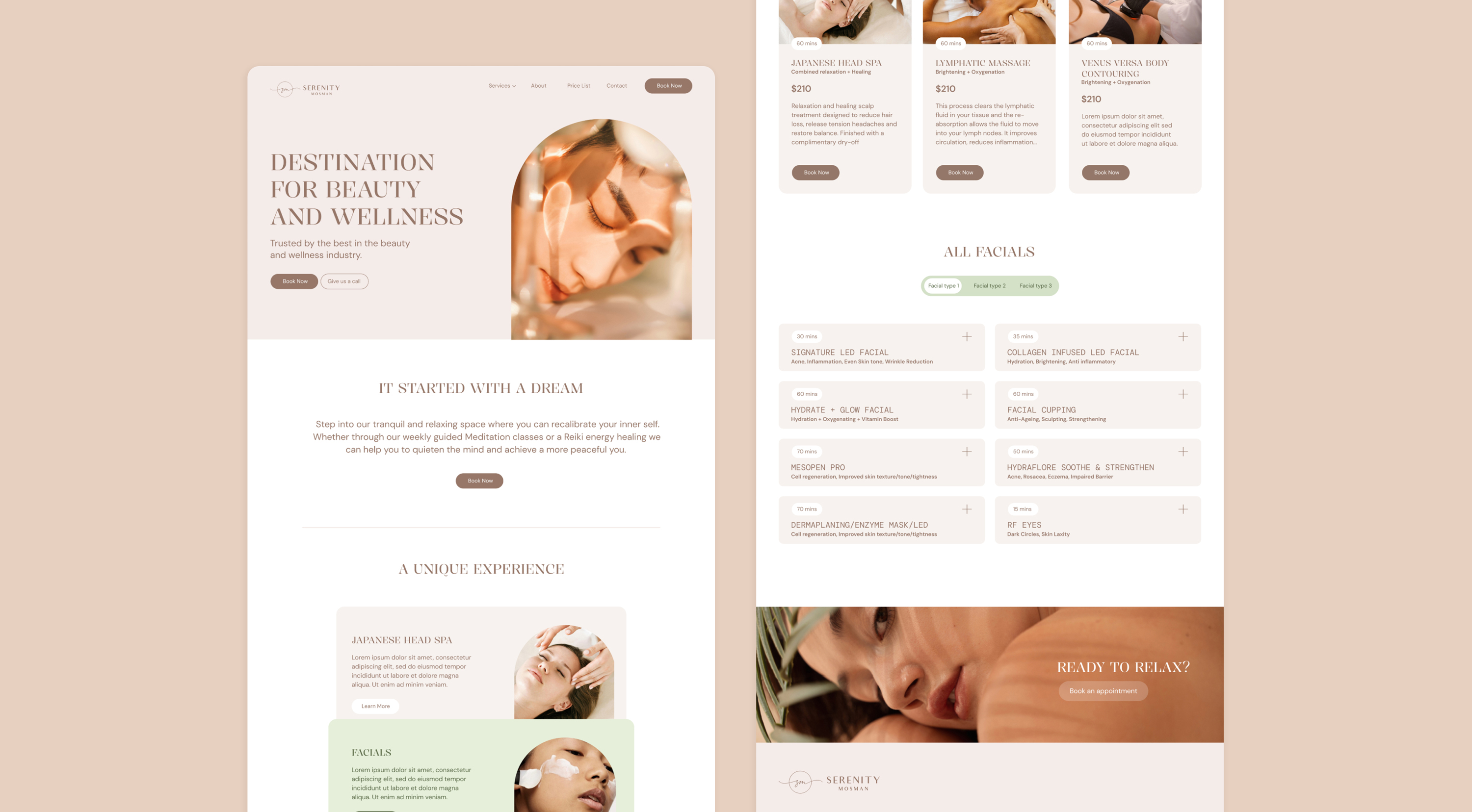
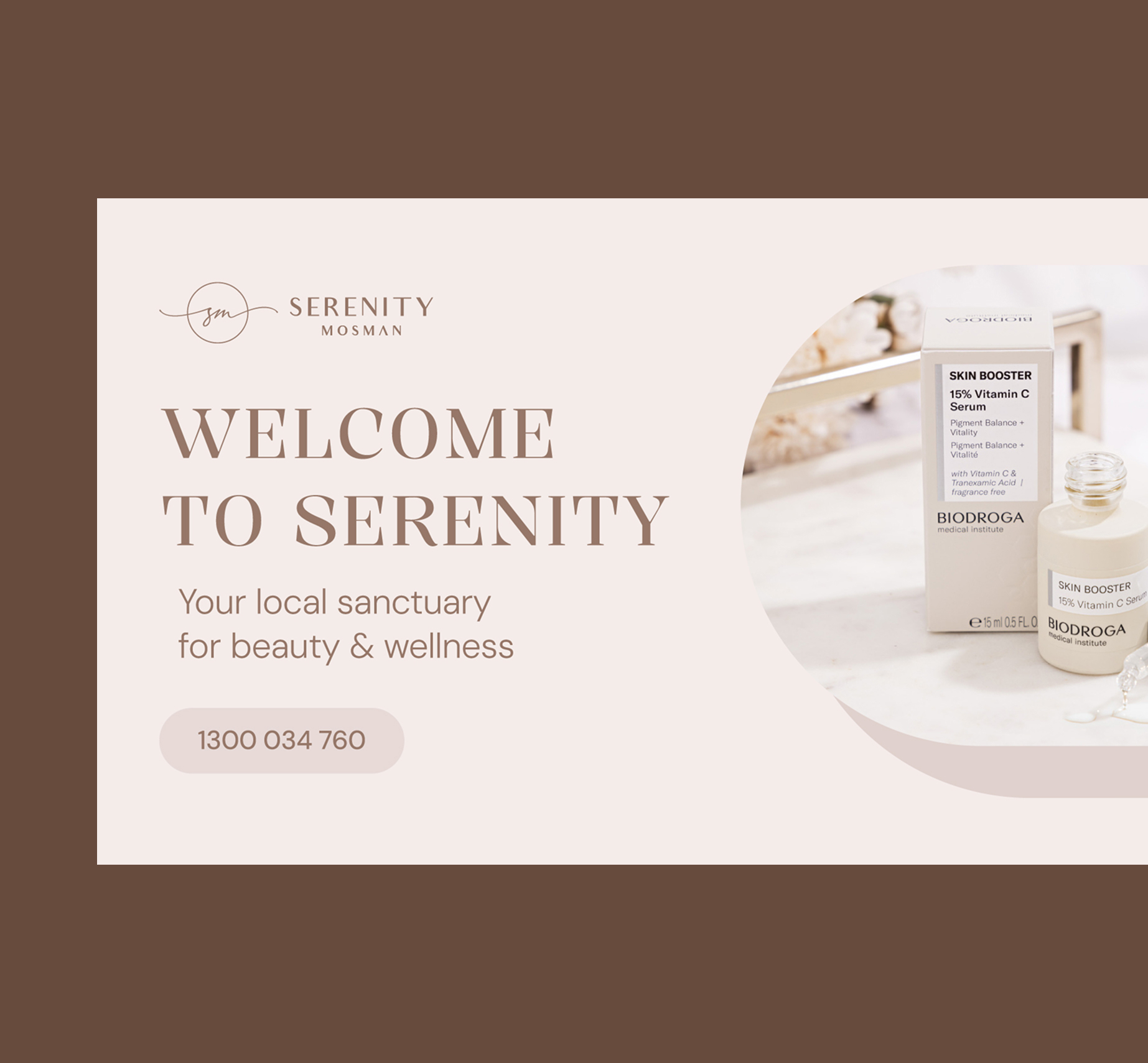
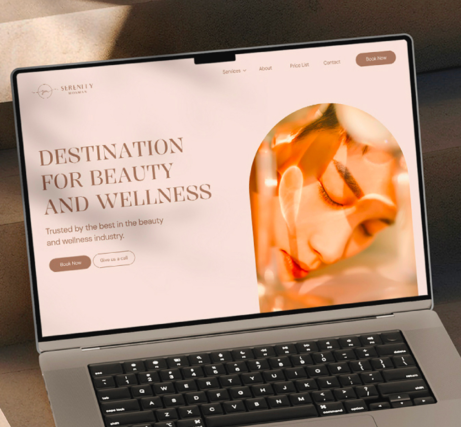
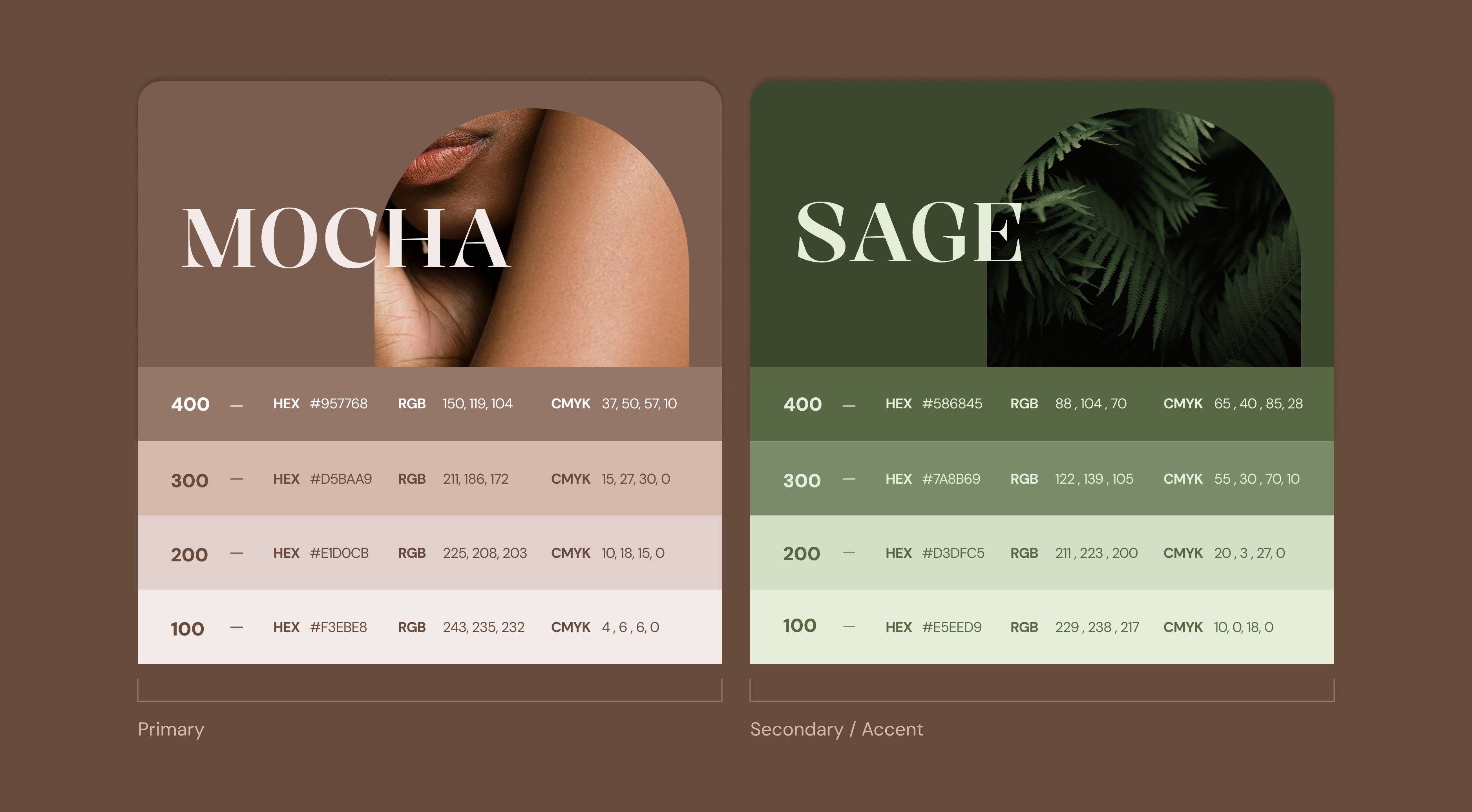
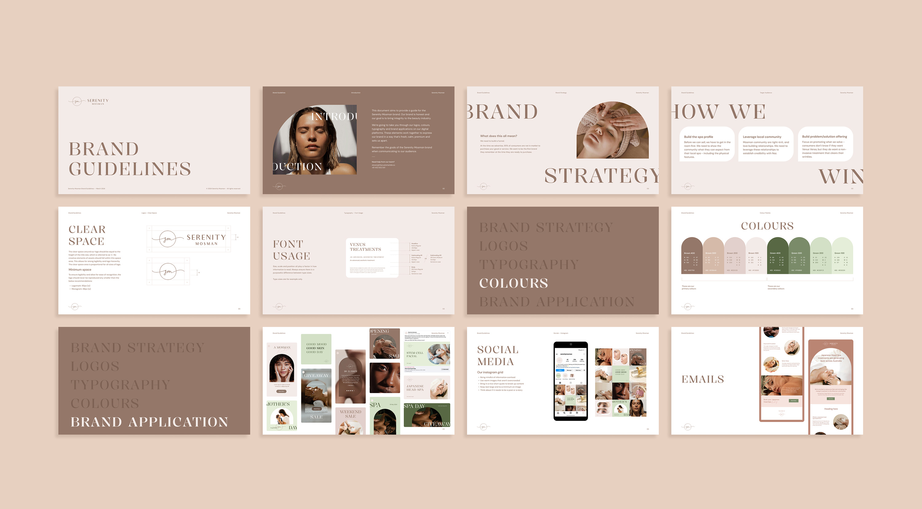
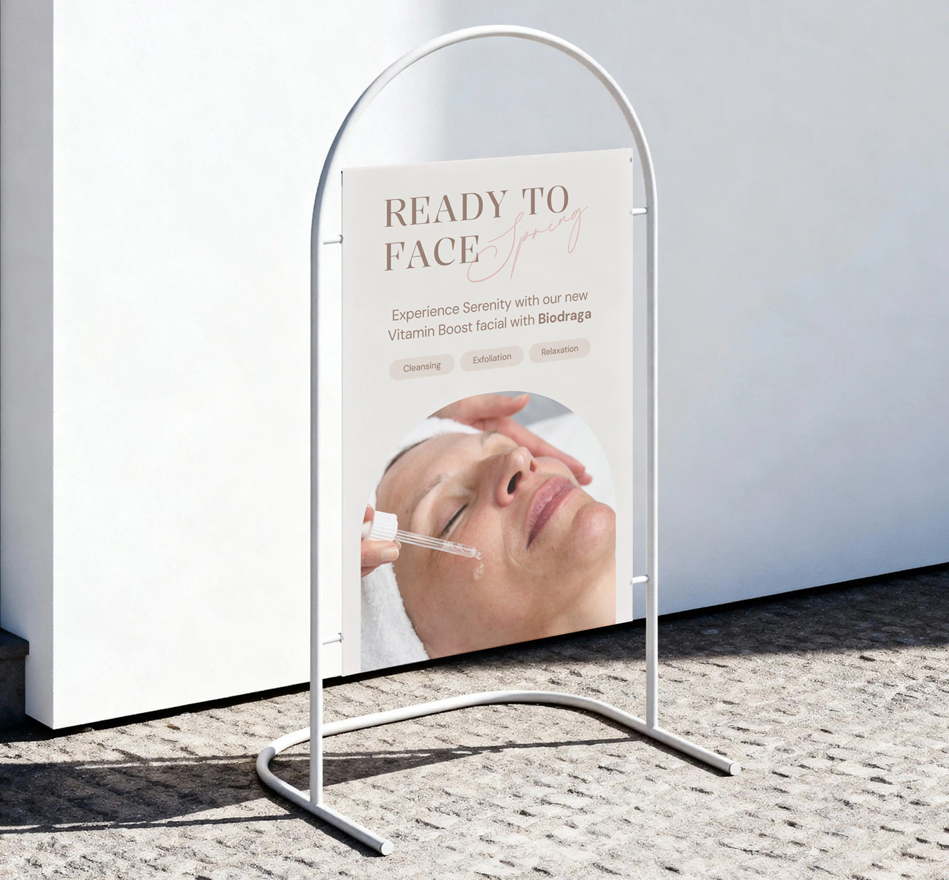
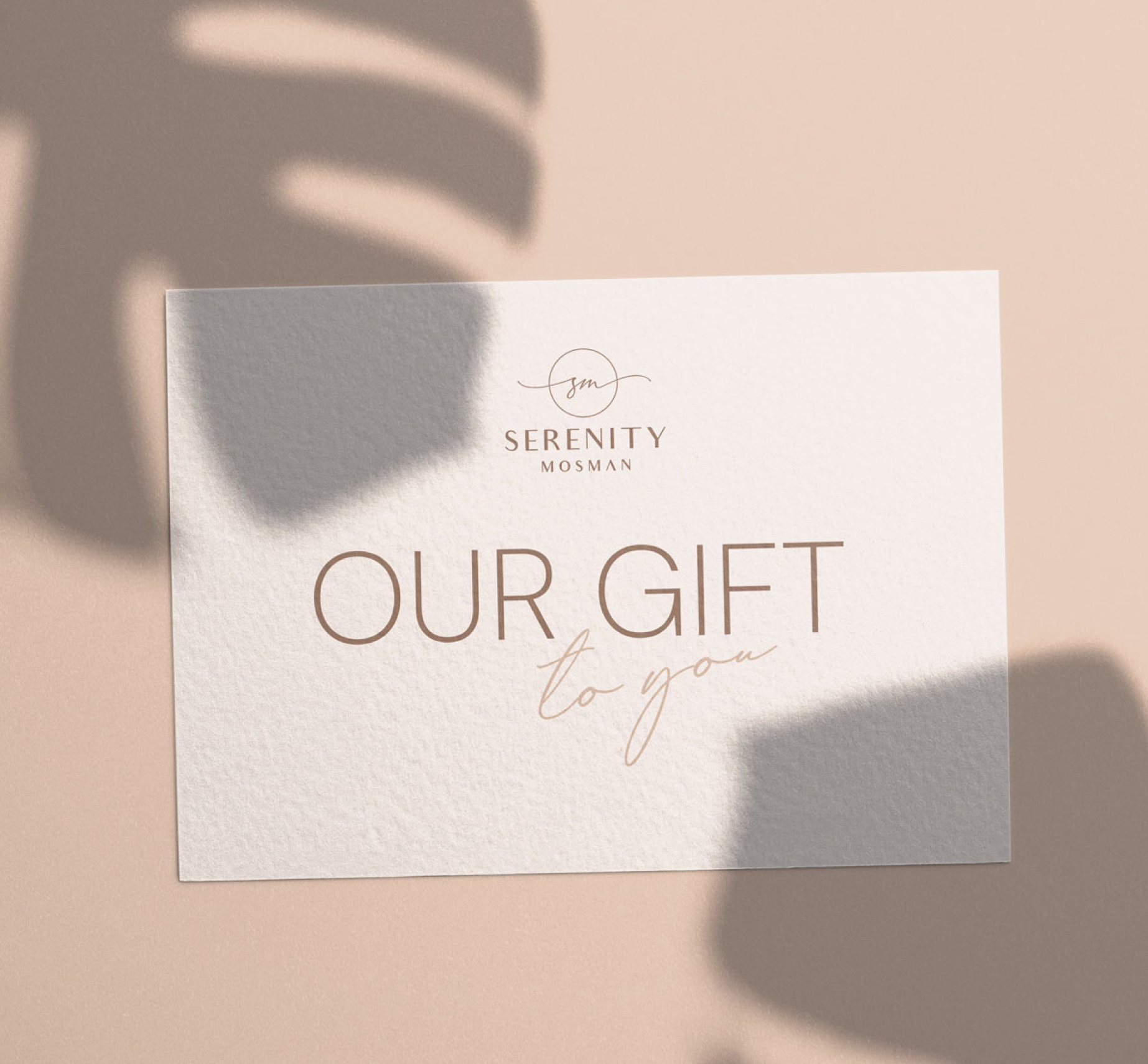
Serenity Mosman came to me with a brand that had real bones – a recognisable logo and an established clientele – but a visual identity that felt inconsistent, outdated, and out of step with the premium spa experience they were actually delivering. The brief started as a targeted brand uplift using their existing logo and colour palette, with a strong focus on social media design for Instagram and Facebook, where the majority of their audience lived. What they needed was a brand that looked as luxurious as walking through their door felt. Working within their existing foundations, I refined and expanded the colour palette, introducing layered mocha tones and bringing in sage green as a sophisticated accent, and paired a refined serif typeface alongside the existing sans serif to create typographic contrast that felt elegant and considered. The arched shape became the brand's visual signature, drawing on the softness of curved windows and arched walkways to communicate warmth and luxury without rigidity. The uplift rolled out across a full brand identity system, social media, website design, and email newsletters, transforming a disjointed presence into a cohesive, premium digital identity that drove measurable improvements in traffic and engagement.